Ecommerce or Practitioners website Case Study
An e-commerce website is often the best way to promote the shop, as search engines do support local businesses. It is also a great way to increase sales and revenue by offering different services.
The challenge of this project was to design a responsive website for a local business or professional.
In our case, we chose a Dentistry Clinic that already had a website so we started by understanding the client, and their desires to propose and improve their actual website.
Overview
Our client, Clínica Dentária de Miraflores, is a small Dentistry Clinic in Algés, close to Lisbon. The team is made up of the doctor and his assistant which is also his secretary.
Their clientele is very broad varying from children to elderly people and Mostly of them come by reference of a friend or family.
There is also a significant portion of their clients that also finds them through the german embassy’s website as they advertise him as a “german speaking dentist” there.
Even though most clients find them through a reference, some find them online (embassy’s website), which justifies the need for a good website.

The Design Process
After gathering a lot of information about the dentistry market we applied interviews with the direct stakeholders to understand their points of view, necessities, wishes, and frustrations.
We had just a few insights from them maybe because their clients used to come from mouth-to-mouth indications and they "don’t believe that a website could change this scenario", but we see this as an opportunity.
By doing a Market Analysis we identified 3 different groups of website references, on which we based our website on:
- International Dentistries;
- Local Dentistries;
- Health Service websites.
We also analyzed different Heuristics around each reference website — to see what we could “steal” and what could be improved and later tried to integrate them into our website.
Based on our competitor's websites we also developed a Sitemap in which we created 4 main pages with no sub-pages — Home, About Us, Treatments & Contacts + Book Appointment button. We also did a Card Sorting Exercise with 6 users for organizing content to be shown on the homepage.


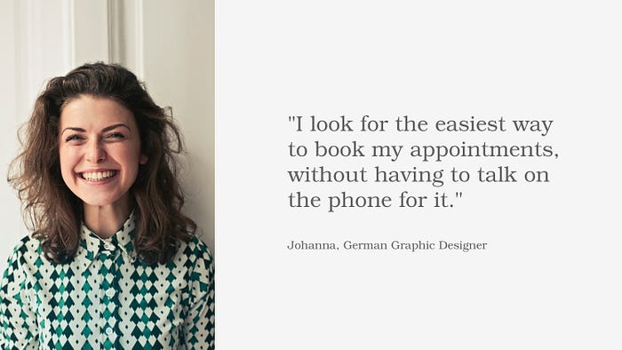
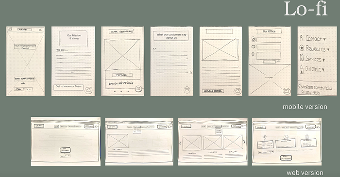
Based on a persona— We created our main user flow (trying to book an appointment online) — and came up with our first Lo-fi prototype.

Lo-Fi Testing:
After testing with 6 people we created an Affinity Diagram with key insights to see what we needed to change to improve.
The insights that most influenced changes were:
- The order of the information displayed;
- Shorten the homepage in general;
- Eliminate the floating button (no one clicked on it);
- Some copy changes as turning the “About Us” to “Our Mission” ;
- Improved details of the appointment-booking flow.
All of those changes, led us to the Mid-fi version, as displayed below.

Mid-Fi Testing:
As in the lo-fi, we tested the mobile version, we decided to test our web version for the Mid-fi to see if we were missing something.
Through a Mood Board, we ideated a bit about our main values, the feeling we wanted to transmit, and our ideas on a possible color palette and fonts, so we could start creating our final version of the website.

We developed a first draft for the homepage of the website based on our Mood Board, but after a Design Critique Session, when we received a lot of good insights, we tried some different ideas.

As we couldn’t find pictures that illustrated well our first slogan — “Your Neighbourhood dentist”— we came up with another one —“Care beyond your smile”— that maintained the main idea of “familiarity” but could be better represented as you can see in our hi-fi prototypes.
Usability tests and insights:
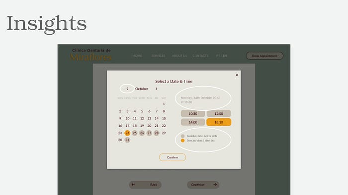
- In the usability testing, we collected some new insights and we already implemented them in our final models, as the highlighted ones in the picture below.

- Some of the features we left for a second phase.
Next Steps:
- Take real pictures of the clinic and team;
- Create a profile section for customers where they can archive their exams;
- Fix the header when scrolling the home page or create a floating button with a call to action;
- Develop proper branding for the business.
Constraints and Outcomes
- Transmitting a certain kind of feeling (in our case: homey, friendly, the doctor that takes the extra mile) with the right front picture was not as easy as we expected;
- We should have looked for a slogan previously and integrated that into our interviews as well. Trying to create a slogan to adapt to an existent design was time-consuming and not 100 % what we wanted but we needed to choose to work forward;
- Different people gave different types of insights and what they expect from a dentist website, some were contradicting but in the end, we were able to integrate the features most mentioned and arrange priorities according to our research insights.
- Regarding the design in general:
it’s not always possible to innovate as much as we assume at the beginning of the process because most people still expect health sites to look the same. So breaking out of this pattern while still making it a “dentistry” website, was not that easy and in the end, we also went for a smile as the front image by following the insights collected from different users. - It's always good to remember that the process of Design needs to be focused on the user needs, not on the Designers wishes.
I would appreciate it if you comment on my process and decisions if you agree or not, and why.
Thank you for getting here!
